Wednesday 8 May 2013

Final DVD Trailer

I am very pleased with the finished version of my DVD trailer. 

Not only does it runs smoothly with the
transitions and 
warp stabilizer to stop the camera shake. Both these small additions made the viewing easier as meant that the trailer did not jump and was easy to watch.

I personally like the planet, as by using this I feel that I drew together all elements of my project, as the image used throughout, and I like the effect of making it grow, and appear to get closer to the earth. The fact that the planet appeared to get closer which enforced the title ‘When Two Worlds Collide’ as it gave the illusion that this is what was going to happen.

I believe that I created a feeling of suspense, which I thought very appropriate and fitted in with my genre, and would leave the viewer wanting more, which is exactly the role of a trailer.

Each clip that I selected helped me to portray my sci fi genre, from the planets, clip of space and the narration, all giving an out of this world sensation, and feel that the clips I picked were the best I could have picked to convey my message.

I feel that I have met the target audience of 15 years and older as it will keep the viewer engaged and questioning what happens in the film, what causes the collision and what happens to the world due to it.

Overall I am very happy with my end product, and the skills and knowledge that I have gained along the way and looking back at my storyboard can see that it is not too dissimilar, all the ideas are the same but in a different order with slight variations. 

Rendering and Exporting

I rendered my work on a regular basis, which in turn meant the project would run smoother and be easier to view, and in turn edit easier. It allows the video to play back in real time rather than being jumpy and skipping frames. 
By rendering the entire work area it meant that all elements were included. 

I then needed to export my video as expressed in the assignment brief, by exporting I am creating one file that can be viewed by many different viewing programs, such as VLC or Windows Media Player without opening the project itself. 


To export my film trailer I went to file > export > media.
Once here I can now export my file, with a choice of different options. The export video format that is needed for the assignment is ‘QuickTime’, and with the correct selection of the DV Pal Widescreen 48 kHz chosen when creating the document I did not need to alter any settings.
Scale to fit also allows the film to fit to screen without stretches the clips and distorting them.
When having both the video and audio selected I can then progress to export.

The exported file will then save in the same destination as my assignment project as this is the source destination. 


Planet in DVD Trailer

For continuity between the DVD label, Cover and trailer I decided to add the same planet into all. To add the planet into the trailer I needed to import it as a still image, using the menu toolbar along the top of the screen. As the image had been used previously in Photoshop the background was already transparent. I then placed the picture as an image onto video 3 layer, so that the planet would appear at the same time as the news banner and the house scene.

I wanted to make the planet bigger and appear to be growing closer to the house, suggesting to the audience that this would be the imminent disaster. To do this I used a similar technique to the moving text. But instead of changing the position at key frame points I changed the scale. This then gave the illusion that the planet was growing, the gradual raise of the line, shows the gradual size increase of the planet. 


Altering clip sizes

Some of the clips where not the correct size and so appeared smaller and didn't fit to the screen. There are two ways to do this and one is in effects control where you can scale the clip and in turn make the clip larger or smaller.
The way that I used with the two clips that I needed to adjust was to simply double click on the image and the corners to scale and preposition the clip appeared.
To make sure that I scaled the clip proportionally to not distort the image I held down shift while I dragged the corner handle. I also had to be careful not to enlarge too much to cause the image to become pixelated, fortunately this was not a problem that I came across.

This technique was particularly useful with the house clip as I was able to position this where I wanted it behind the news banner to show as much of parts of the image I wanted, i.e. more sky.


Adding Sound to Premiere Pro

I needed to add sound to my project, and could have done this many ways, I could have recorded my own audio and inserted it, or combined audio together, and used audio effects. However I had previously when downloading clips for the film itself, found a narration that I quite liked from War of the Worlds that fitted  with my sci fi theme.

The audio that I wanted was on a clip that had footage, however I did not want the footage so needed to remove this, to do this you have to right click on the footage when inserted on the timeline then and click unlink, the unlink allows the audio and the footage to be pulled apart.

I then deleted the footage so that I was only left with the audio.
The audio I then placed on the audio layer and made the length of video by cutting it at the length.

By using the pen tool I was able to fade out music at a point where I wanted, to do this I selected the pen tool and clicked once where I wanted the volume to start to reduce, which can be seen here with the white dot, and then click again further on, at a lower place, which caused a downwards line, which showed how the volume lowered and fade. I did this at both the cross over between tracks and at the end of the clip.  I also contemplated fading in the second audio track but when trying to do this discovered that the narration started too soon, and so was not loud enough to be heard.


I found that with the different pitches and beat to the track I could place the clips strategically on the audio.

Text on Video

I also felt necessary to have text within my video and I did this by adding title sequences to my film. |And this is done simply by selecting the title button from the toolbar across the top of the screen, and then a separate window pops out where you are able to type you text.


Using this title tool I am able to type text, alter the colour, font, positions, alignment, size and style of the text. 
I first used this tool to do the title for my movie. 


When looking at the title I had the background showing as the scene of where the title text would appear, this way I could pick the best style and what it would look like on the film clip. I could also play the clip on the right hand side of the screen. The title sequence is then saved when the box is crossed and can be edited by double clicking on the text at a later date. 

The title can then be added to the timeline by clicking and dragging and dropping in the same way other clips are added, by placing it on a higher video layer it means that both the video clip and the title clip will play. 
I used red in the title font as felt that it was a good used of colour to match the scene due to the orange explosion and still stand out enough to be read. 

I also wanted to use text later on in the trailer but in a different way, and so I first began with making the title sequence, as shown below:


I decided that I wanted to make this text move, and to appear from one side of the screen and roll off on to the other side, and to do this once the title sequence was placed on the timeline I could go to effect controls. 

I was able to make the text move by placing it where I wanted it to begin with, which in this case was off the screen, and here I then inserted a key frame  on the motion section of the effects control panel, which can be seen here on the right, at the beginning of the sequence. I then moved the text again, but this time to the opposite side of the screen and inserted another key frame, but this time at the other end of the sequence, the line below shows the movement of the text, when played back the text then went from appearing on the screen to being off the screen, by moving in a left motion.

I like this effect as would keep the viewer engaged and causing suspense which is an emotion which I wanted to create, leaving the viewer yearning for more. 


Warp Stabilizer Effect

I used the Warp stabilizer effect on my own footage, as due to filming it myself the camera had a slight shake. 
The Warp Stabilizer allows me to stop the slight jumping that is caused due to camera movement and allow the shot to be smoother.
This effect is also found in the video effects.  

I first selected the clip that I wanted to stabilize, that be the clip of the house, and then on the effects panel again dragged and dropped the effect on the clip in the timeline.
After the effect has been added analysis begins, and then after analysis, stabilization. 


The only difference here to other clips was that I had to alter the sequence settings to the house scene to match that of the project settings, as when I initially tried to stabilize the clip when the sequence size was not the same it would not work. I had to alter the fps, as that of a camcorder is different to that of film footage that I had downloaded. Once I edited the sequence and in turn the size I was able to save this as a premiere pro clip and then easily insert it to the project document. 

I felt this effect was appropriate and important to use, as allowed for the normal camera motion, but be smoother and not jumpy to disorientate the viewer. 

Own Footage and changing its size

I decided that within my video trailer I wanted to import some of my own video footage and felt that it would be most appropriate to have over the breaking news banner, and so decided that I would film my house, a short 10 second clip, that would be as long as the breaking news banner.  I felt that this would best be used as would allow me to convey exactly what I wanted.

I debated how best to implement the clip, and thought I could have the disaster somehow appearing on the footage.
I decided that I would use the planet that was in both my cover and my label, to again tie all the elements together and the theme throughout and the audience will see that all 3 sections are linked, not only did the footage work well in that respect it also allowed me to save time as did not have to research for any other footage to use under the breaking news banner. 


I picked a nice sunny day do the filming and simply filmed for around 10 seconds, I did this a couple of times to make sure I had a good selection and appropriate footage.
One of the short films had a small bird flying across it, which I liked, and so decided to use this clip, as meant that the scene was not as dull.

I added this clip to the Premiere Pro document in the same way that I added other clips and was able to edit it in the same way.

Colour Correction

I used this technique when I had both clips from the Cloverfield film, which were the ones containing the action. The reason I used this tool was because when place side by side and played the back the two clips were of completely different colouring and I felt that one clips looked out of place and in turn didn't fit together sufficiently.
One of the clips already had an orangey tinge to it, shown below, while the other was a much darker colour and not as bright.


The colour correction is found in video effects and is added to the clip in the same way that a other standard filters are added and just dragged and dropped on. When the effect is added and effect controls to the video are selected a circle is shown.
Here you can alter the brightness and contrast of the video this in turn allowed me to make the darker clip brighter and not as dark.
I can also drag the colour of the line that is shown in the circle and rotate it round to alter the colour of the clip. I quite like the orange effect in the second clip, and so altered the first clip.
This tool also allows you to emphasize or de - emphasize details in the clip, but this I chose not to use.


I moved the scale to the section, but found that this was not a close enough match to the other clip, and so I began to edit the colour of the other clip, by using the same tool, in the hope that I would be able to edit both  clips to a close match. 

Green Screen and Chroma Key

For the news screen banner that I downloaded there was a green screen as the background. The green part of the video I didn't want, instead I wanted to just have the banner along the bottom of the screen, and then behind playing another clip that would show the imminent disaster that was about to happen.
I began researching how I could get rid of the green screen on the internet, and was directed to the Chroma Key effect.


The Chroma Key effect is works in the same way a colour mask works on Photoshop.
I searched for chroma key in video effects, and then dragged and dropped it over onto the breaking news banner video.
I could then go to the effect control panel to the video and using the colour tool in the chroma key, could select the colour match tool to select the green of the video. This then worked by making all the elements of that video of that colour transparent, and in turn then allowed for any video underneath to show through.
The edge of the banner still had a slight green edge but by using the similarity option and dragging the number up and down was able to remove the green edge completely. 


After using the chroma key effect the layer that I would place underneath would show through. This is exactly the effect that I wanted to happen and I was very happy with the outcome. It allowed me to fit the disaster into my trailer and appeal realistic due to the news banner and make it seem as though it was everyday current life. 

Transitions between clips

When clips but together when played, they can just move between and can at times appear jumpy as just jump from one to another, and not play smoothly, this can cause the user to not become uncomfortable as can be difficult to watch. 

Premier Pro has the ability to add transitions to the clips, when looking in the project box and going to the effects. In the effects panel there are many things that can be done here such as Audio effects, video effect and audio and video transitions. 
I felt that the video transitions effects improved the way the trailer ran and looked, and in turn I felt looked more professional, as had a better overall finish. 

The transitions are added in the same way that clips are added on to the timeline, by clicking and dragging the effect across to the point where I want it, between two clips. 


Below shows one transition I used between clips, which was a slide transition, which slides one clip across to reveal another. 
I liked this effect as felt that it kept the action moving between the two scenes, and in turn kept the action going throughout the trailer. 


I also used fast blur in between the clip of my own footage and a Cloverfield clip, and fast blue out when the title text was on the screen with the exploding planet. 

Timeline Placement

I can add videos to my timeline simply by clicking on the clips and dragging across to the timeline and place them where I want them. This was easy to do and the clips could be place at any point on the timeline, they can then be easily moved, and placed in different orders.

By pressing space bar or the play button I can play the clips that appear on the timeline sequence.

By having video 1,2 and 3 these can act as layers and can be hidden by clicking on the eye, similar to that of the eye in Photoshop and then allows more videos or effects that are on top of one another to be seen. This is also the same case with the audio option.


Cutting clips

When creating my DVD trailer I was required to cut some of the clips that I downloaded, to allow me trim and change the size, and in turn just get the sections of the clips that I wanted to use in the trailer. 
To do this I double click on the video that I want to use and this then in turn goes on the left side of the screen. I then play the video and move the play head to the part of the clip where I want to cut the video and again move it to the end to the selection where I want to end the clip. 
When at the beginning of the selection I want and use the mark in and mark out tool, shown below. The green bar that the appears in the section in the middle is the selection. 
I can then drag the clip down by dragging the picture on the screen down, I can then place this into the clips bin. The clips bin will then contain all the clips that I have cut, with the original footage still being available in the original footage bin.
The clip can then be dragged across onto the timeline and be used in the trailer. 


Downloading clips

In order to create my DVD trailer I downloaded some clips from YouTube. These videos that I downloaded, I felt were vital in helping me explain the story, and help convey space, and the world, in a way that enforced the science fiction genre that I had picked. 


I was able to download them using http://keepvid.com/
The original clips that I used from the internet can be found below: 

  1. Green Screen New Banner = http://www.youtube.com/watch?v=YvObDESemFY
  2. Cloverfield Bridge = http://www.youtube.com/watch?v=dVCki9kwF_4
  3. Space Beam = http://www.youtube.com/watch?v=SpkrVw_E6Nw
  4. Preview Screen = http://www.youtube.com/watch?v=8rh2sNT7tVg
  5. Jason Statham = http://www.youtube.com/watch?v=FJ9PKxWyA0o
  6. Crowd of People = http://www.youtube.com/watch?v=IvNkGm8mxiM
  7. Planet Collision = http://www.youtube.com/watch?v=dX_SEuczp0w
  8. Universal Studios = http://www.youtube.com/watch?v=PNsz-GS0A3E
  9. Narration = http://www.youtube.com/watch?v=2OwFu97yfDg

Setting up a Premiere file

When beginning to create my DVD trailer in Adobe Premiere Pro I first had to make a new project, with the correct format for what the assignment required.
The assignment required the Project Video format to be set to DV Pal Widescreen 48khz.

When I first open Adobe Premier I simply clicked new project and then altered the settings that were set as default in the following screen that appeared.

The Video Display Format needed to be set to Time code, this meant that the timeline is set in second and not frames, and in turn will allow me to see when my video trailer was 1 minute long.

Capture Format; DV; this allows me to select either Digital Video or High Definition.

I then saved the project and named it 'Assignment'.  
When saving the project I am also asked about the sequence setting, and it is here that I will be using DV PAL Widescreen 48kHz, as this is the what the assignment specifies that we use I also altered the Timebase to 25fps, with a frame size of 720h and 576w. 

To set up the project further I also set up a number of bin within the document, these bins are folders, and allow me to remain organised throughout the created of my trailer. The sources that I will gather and use will then be imported into the correct folder.


The folder for clips was for the clips that I cut from the original footage. 

Storyboard for Premiere

I began first thinking about how I wanted my trailer to look and how I wanted it to be set out and in what order.
I made initial ideas, and used a storyboard to help me plan how the trailer would look and what action it would follow, by drawing scenes and seeing how it would fit, and play.
Below is the storyboard that I created:


Research for DVD Trailer

I began my research for my DVD trailer but looking at other DVD trailers already made and what they looked like to see if I could use any of the styles they take on myself.

I knew that my genre was that of science fiction and so began looking at trailers with this same theme. I first began looking at War of the Worlds, Avatar and Star Wars as these were what I looked at previously for ideas to do with the DVD label and the DVD cover.
I then looked generically at other other trailers to determine what other ideas I could implement.

When researching I was bearing in mind whether or not the trailer told the story of the film, so to make sure that the film was known and the basic story also known, so to make sense, and if they were in keeping with their labels and covers at all.
It is important the consumer knew the theme, story and genre all in a minute, and was eye catching enough to make them want to watch the rest of the film. The trailer I felt needed to contain a certain amount of suspense for this to happen.

I knew that I wanted the film to be aimed at a target audience of 15 years or above and so looked at films of a similar age, to see how scary, or graphic they were, as didn't want to be over this age group, but at the same time I wanted to keep it engaging enough so that other people of older age groups also were wanting to watch it. I felt it was important to make the trailer appealing to everyone.

I listened to the audio to see how that fitted in and  found that the majority of them had upbeat, fast music that fitted a genre of action, which in turn could also be linked to sci fi and also found that some had narration, which is something that I thought I could implement. I personally like the narration from the War of the Worlds trailer.
A lot of the trailers also had a dark feel to them which again was something that I thought appropriate to the style.

All the trailers also contained the title, shots of the main characters, and the makers of the film such as the studios, and many included a preview screen for the audience.

Practice for Premiere Pro

Again as I had not used this software before I needed to practice using it.
The software contained many features that enabled me the easy ability to edit videos.

The practice for this I edited a simple meerkat video that I took off the internet. When practicing I learnt how to cut videos to change their size and only use sections that I need, alter the colour using colour corrector, either to make two scenes match, or make the appearance of the light changing throughout the day.
I also practiced how to use transitions, and edit sound volumes, all that would pull together videos that are cut up and merged together to make a whole video, that ran smoothly without jumping.

All these techniques that I practiced here I plan to use in my own movie trailer, so will blog about these in further posts.

Tuesday 7 May 2013

Stage 3 of Assessment - Create a DVD trailer

For this part of the assignment I am required to create a short (1 minute) promotional video for my finished package, which in my case will be a DVD trailer.
This video must be edited in Premiere, and you may import previously created elements from Photoshop or Illustrator, which I will import my planet from Illustrator that I also used in Photoshop. I will be expected to demonstrate the ability to import images and video, setting up a Premiere project with the right frame size and frame rate and widescreen. I will also need to trim clips, add transitions to clips, and add titles over clips. 

Complete DVD Label

This is my complete DVD label for the disc containing my trailer.
I am very happy with the overall finished product. It contains all the key elements that appear on DVDs such as the, information about the DVD, such as the age, and a title. It is also clear and easy to read.
I personally feel it is very appealing, and am very happy with the end product, as felt that when creating this as using a tutorial I used many skills that we hadn't been shown in the practice, so feel I may have many skills that people do not have, and I am also very proud that I created this, as feel that by teaching myself some of these effects I am more likely to take them on board and remember them.
I think that label is eye catching and not too cramped or busy. A continuous theme of sci fi, due to the planets and stars runs throughout, and relates to the DVD cover, as the same planet is on both elements.
I am also satisfied that it reaches the target audience well. It I feel is suitable for 15 years and plus and all the images coincide with the theme.

I am also pleased that I managed to find a text tool that allowed me to make a similar style text on both this and the cover case, so that the theme also coincides.
The colours are strong and the planet and the title stand out well from the background. 

Although this is not my original idea or how I imagined the label to be I am very happy with the finished outcome. 


DVD label Clipping Mask

Once the label is complete I have to apply a clipping mask. The clipping mask will in turn get rid of the bits round the edges that do not need to be seen and are not part of the disc itself.


To be able to make a clipping mask I drew an circle using the ellipses tool from the centre and went to the further circle guide. I then selected all the elements withing my DVD label by pressing CTRL + A, and with everything then selected I Object, and then selected clipping mask and make. This in turn leaves everything selected within the guide and deletes any off cuts, to leave the product looking like a DVD label. 


Creating a DVD label

When I realised that I needed a  new idea for my DVD label I decided to look on the internet for tutorials to see what other idea were out there and what I could implement myself.

I found a tutorial to follow to use as my DVD label. The link that I used is below:
http://vector.tutsplus.com/tutorials/illustration/vector-space-composition/

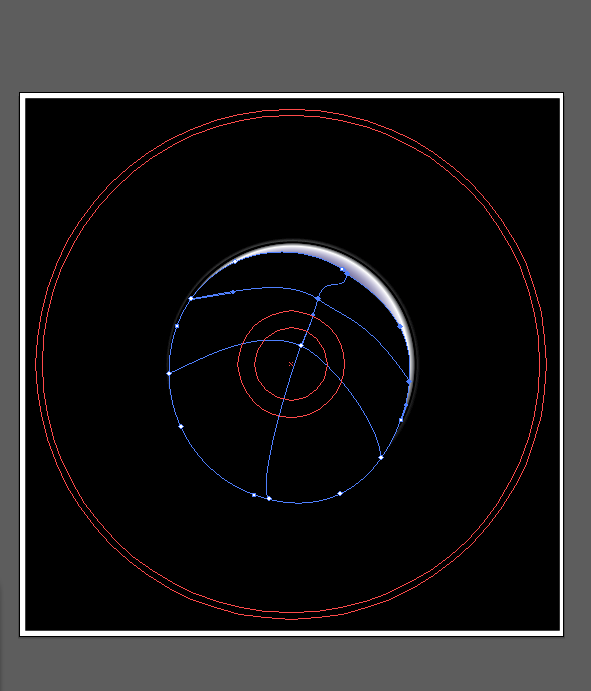
To begin I added a background to my template of a black background using the rectangle tool, and then used the gradient tool to go from green to black. The green halo will be used to make the planet stand out and glow, and so in turn the centre of the planet is the centre of the green gradient circle. I decided to place it in the centre of the DVD label.


I then used the ellipse tool to add a circle over this gradient, that I then filled with a gradient that went from dark green to black. By moving up and down the line I am able to alter how the gradient with the two colours appears.


I then added another circle over the top again, slightly larger, with a gradient that went from blue, white and black colours. The arrows on the gradient scale, and be added by double clicking, or removed by being dragged down off the scale. 


I then used the ellipse tool again filled with a solid black colour. I used the selection tool to rotate the ellipse, and the handles shown below that allowed me to alter the shape of the object. 


I then used the mesh tool found down the left hand side of the menu bar to draw a grid, I drew a grid 2 by 3, and so had 6 nodes. I was able to alter the lines of the grid by using the selection tool. I was then able to fill the nodes with colour, of which I used white. 


I then selected the gradient mesh and and set the blending mode to multiply in the transparency panel.


I then also grouped the circle made earlier and the Gradient Mesh, using the group option in the drop down menu in the top of the screen and then set the Lighten Blending Mode for this grouped object and reduced the opacity down to 80% in the Transparency panel. This in turn allowed the blue from the underneath layer to appear through. 


I then grouped the planet object and copy and pasted it to make two planets. I then selected one of the planets and used the selection tool, and holding down the shift tool I was able to resize the planet object as a square and I then placed this where I wanted it in the bottom right of the disc. 
I then altered the planet by Object > Transform > Reflect, to change where the glow on the second planet was placed. 


I then also altered the angle of reflect. 


I then Set the Blending Mode for this circle to Screen and reduced the Opacity to 60% in the Transparency panel. This changed the colour of the planet completely, I am not entirely sure why, but actually liked the effect that it gave. 


I then began making the Saturn rings for the planet. I used the ellipse tool to create a circle, and then used the gradient tool. This gradient will consist of alternating black sliders and various shades of yellow.
I selected the rings and stretched the object to be oval rather than circle and then
 did Object > Transform > Rotate to alter the angle of the rings.


I then needed to hide the part of the Saturn rings that would hide behind the planet. 
I had to create a circle, and using the Scissors Tool on the left, cut it at the at the bottom part of the inner rings and then remove the bottom part. I then had to use the pen tool to connect the two points, that then formed a semi - circle. The semi - circle shape that remained I then set to a gradient mode of black to white and then again alter the transparency mode and set it to multiply, which then allowed the colour underneath to shine through. 


I then had to work on the background around the planet. I needed to add stars and planets to the background. I needed to create a circle and fill it with a radial gradient, then set the Screen Blending Mode. I did this using a blue colour. 
I then created a new circle filled with a black to white radial gradient. Set the Screen Blending Mode and reduce the Opacity. I stretched the circle to make it a thin oval and copied the image to make two ovals. 
I transformed and rotated one, and was then able to select them and make a cross. 

I then grouped all the elements of the star and altered the size, I then dragged the object to the symbol section and saved it as a new character.


I also did this with the planet and named the symbols.
I was then able to use the symbol sprayed and spray the symbols on the background, so did not have to insert each symbol individually. 

I then needed to add the text that appears around the edge of a DVD disc and so did this by drawing an ellipse around the disc where I wanted it to be and then used the type on a path tool, and was then able to type on the circle and could alter the size of the text, and could drag it round to position where the text starts.


I then needed to add all the generic images that go on a DVD, I did this by placing them into the document, from the Photoshop document.


The images I had already previously edited in Photoshop by using the magic wand tool and getting rid of the background, so I did not need to edit them here, instead just place them in and move them to where I wanted them.

I then needed to add the title to the label I used the text tool to type the title,  and select the same text and colour that were are on the DVD cover to draw comparisons. I altered the text style to be arc, I then bent the text and distorted the text, and was able to make it look similar to that of the title text on my DVD cover.
When I'd made it look similar I then transformed the text to be able to rotate it and make it sit around the planet, similar to how the title sits around the moon in the cover.


Original label ideas

My initial idea for my DVD label was that of planet Earth and another planet merged together.
I began by picking a picture from Google of Earth that I liked, and began by using Photoshop to edit the image which I would then later import into Illustrator.

I used the magic wand tool to select the parts of the Earth that I wanted. I decided to keep the sea and so selected the land. Once I had all the bits of the land selected that I wanted I then deleted them to leave me with just the sea.
After I had done this I then placed this in Illustrator. I then began thinking about how I could merge another image into it, and what to do next.


I started to experiment with solar flares, and adding another planet behind the sea layer but could not find anything that I found suitable. I tried inserting just a plain background.


I decided that I didn't really like this effect either and didn't really know how else to develop this label further and so changed ideas completely and began looking for other inspiration.

Sources:
http://www.esri.com/news/arcuser/0610/graphics/nospin_2-lg.jpg

Creating a DVD label Template

Before I could start creating my DVD label in Illustrator I had to make a template that would replicate that of a disc.
I first began by using the Ellipse tool to create circles. I needed an outer circle followed by a slightly smaller inner circle. I also had to do the same with two inner circles further in the centre of the larger ones.
I researched the size of a DVD label to make sure I knew the measurements. By making sure the ellipses were all in the centre I was able to make a template that resembled a disc by having the correct sizes.


I then, using the top menus went to View menu, guides and the make, this in turn allowed me to make the circles into guides. I did this again to lock the guides to stop them moving. I will then be able to add things to the disc template and see where they will sit on the disc and what will be cut off from the edges. 


I also set the colour to CMYK, the same as my DVD cover, as this is again the colour format used when printing.